
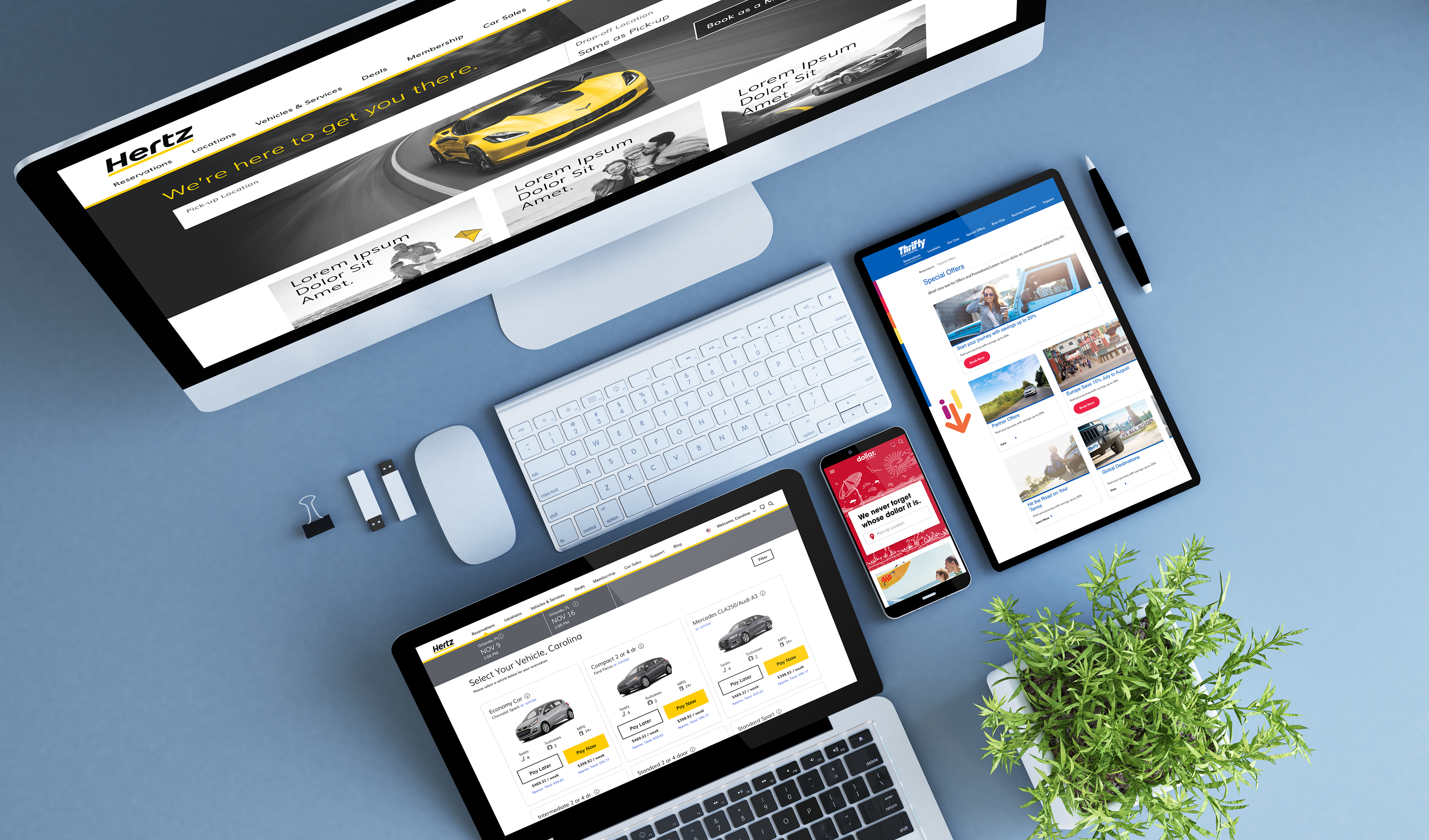
In mid 2016 The Hertz Corporation decided it was time for a refresh, not just for them but also for their two acquisitions Dollar and Thrifty. At the same time they hired their first UX/UI designer (one guess who), and lined up their first agency (Chaotic Moon) to launch a Digital Transformation effort for all five websites and the apps, they also began rapidly expanding their Daigital Marketing department.
This archive focuses on the key phases of the transformations of each site and brand, with examples from each phase, ending with the state of the transformation at the time of my leaving in 2019.
Hertz Redesign
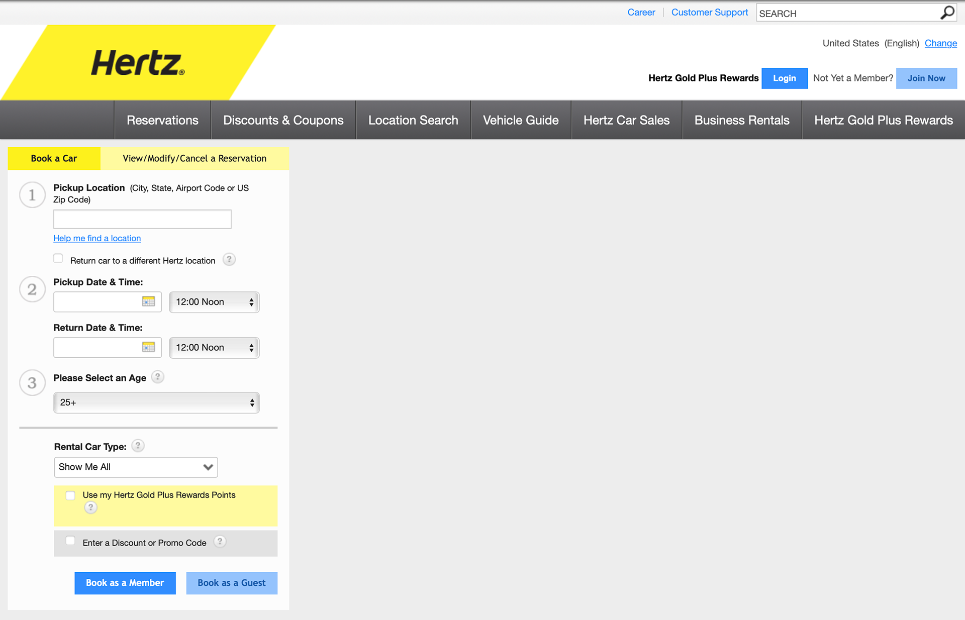
Before 2016
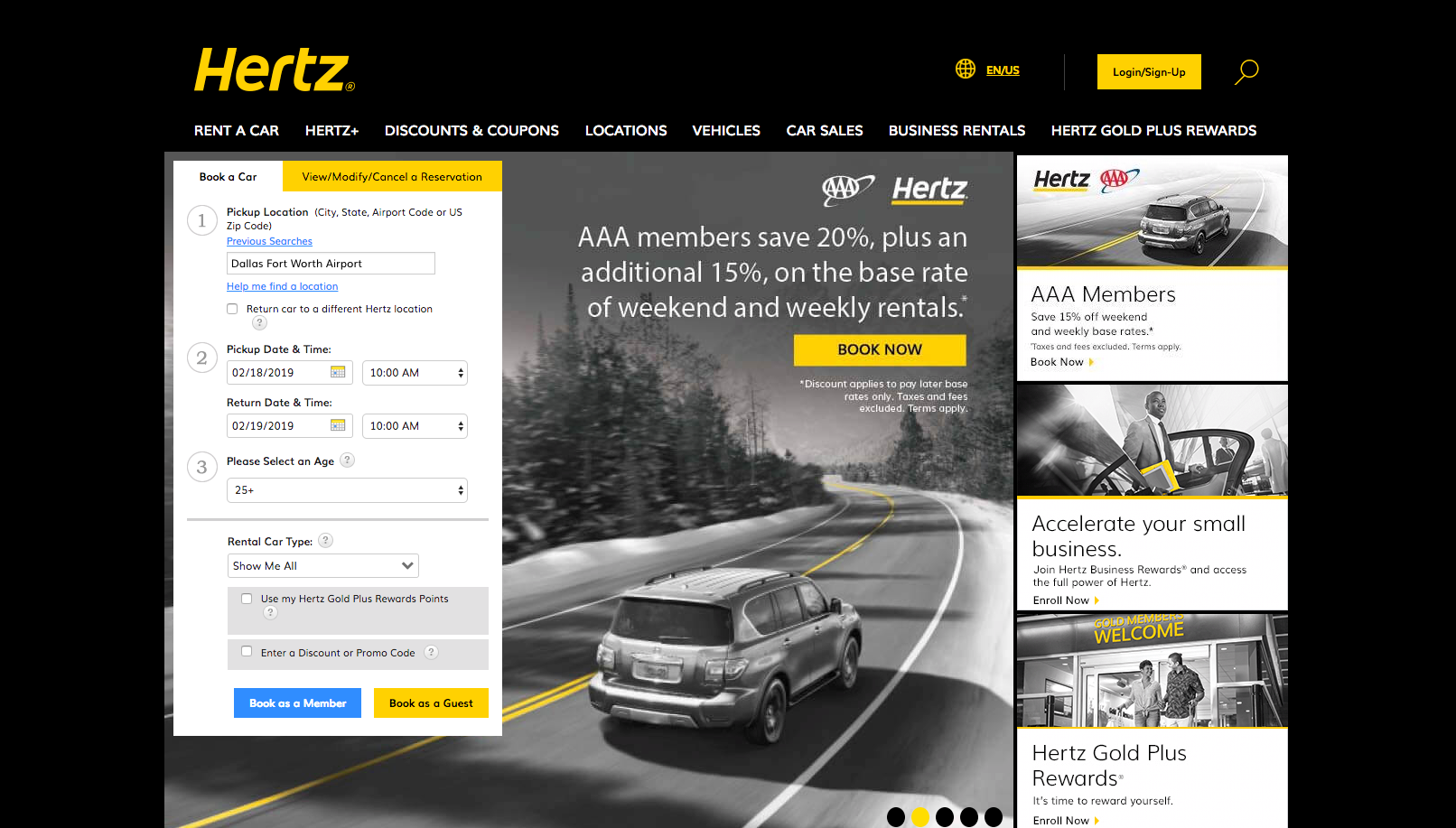
First Rebrand 2018
The first phase of the Hertz rebrand looked to recapture the status of old, represented in a trendy luxurious way. The brand direction here was to harken back to the original yellow logo and contrast with solid black, a trend in luxury brand sites at the time. This phase was marked with some minor site improvements and backend data clean up, and a few substantial visual changes. During this phase we were rapidly AB testing minor tweaks and documenting those learnings to feed into the Transformation efforts to be completed by Accenture (acquired Chaotic Moon and took over the project).
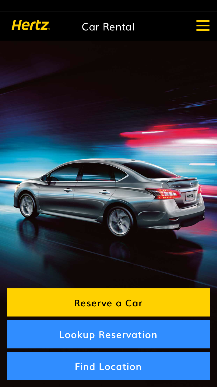
Business moved at the "Speed of Hertz" and due to changes in executive leadership our brand and transformation directions changed as well. This resulted in changes to our transformation look and feel, now seeking to be impactful it was all about the yellow, with digital applications shifting to more of a pops of color strategy. The new digital look also called for a more up to date look with a large center hero image and focus on the reservation bar. Additionally this allowed us to add weight to marketing cards and take away
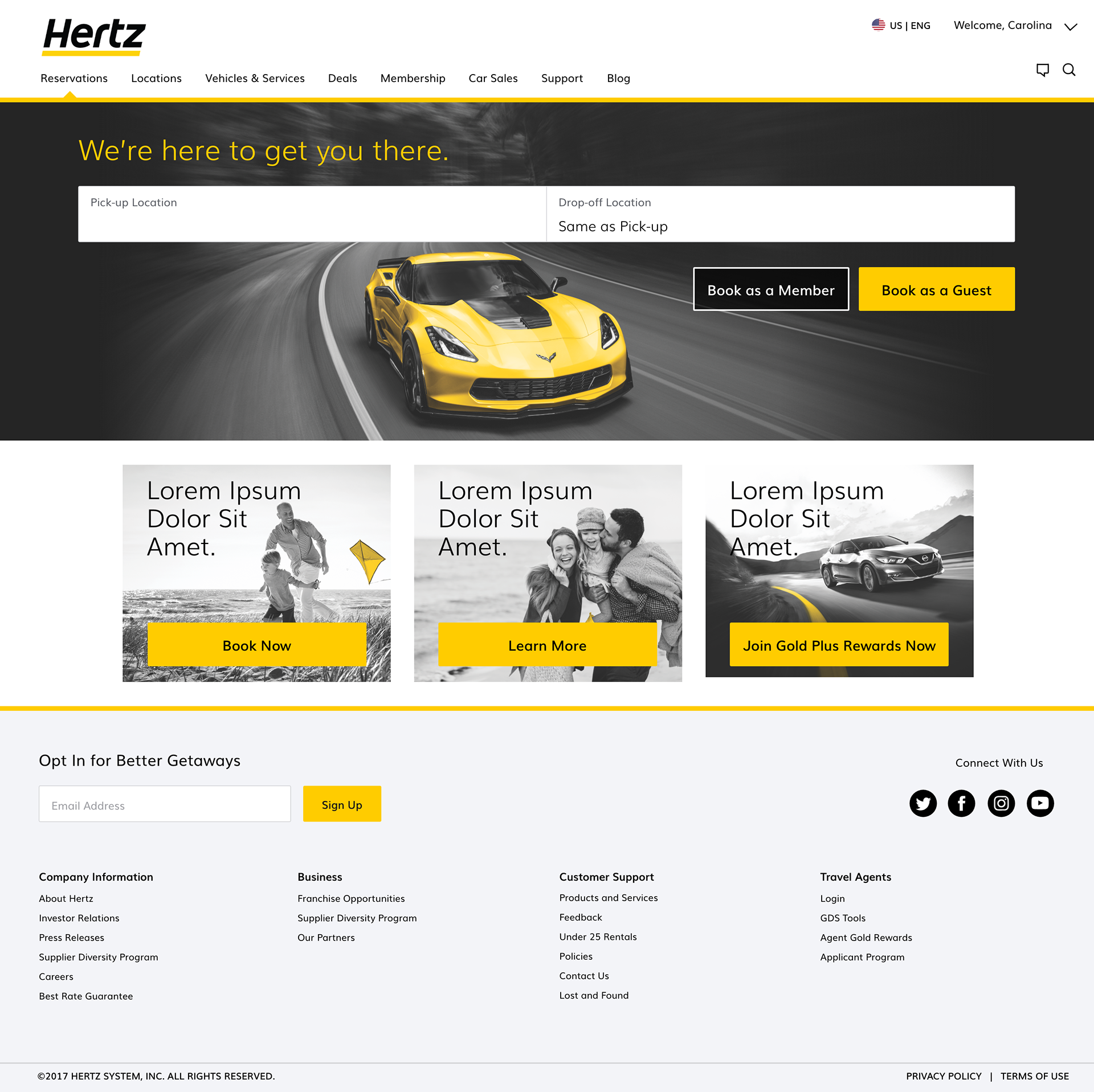
After Digital Transformation and Second Rebrand 2019
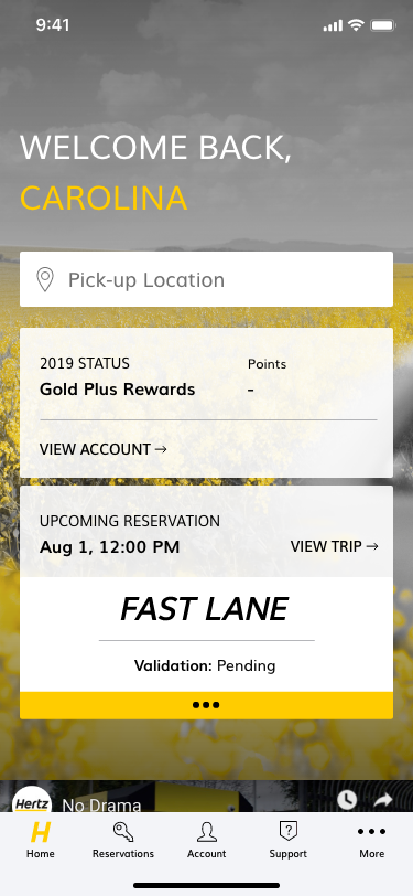
Mobile Redesign
The Mobile redesign followed a similar pattern to the desktop but with an extra emphasis on elevating the member experience for quick access to their account when picking up and dropping off.
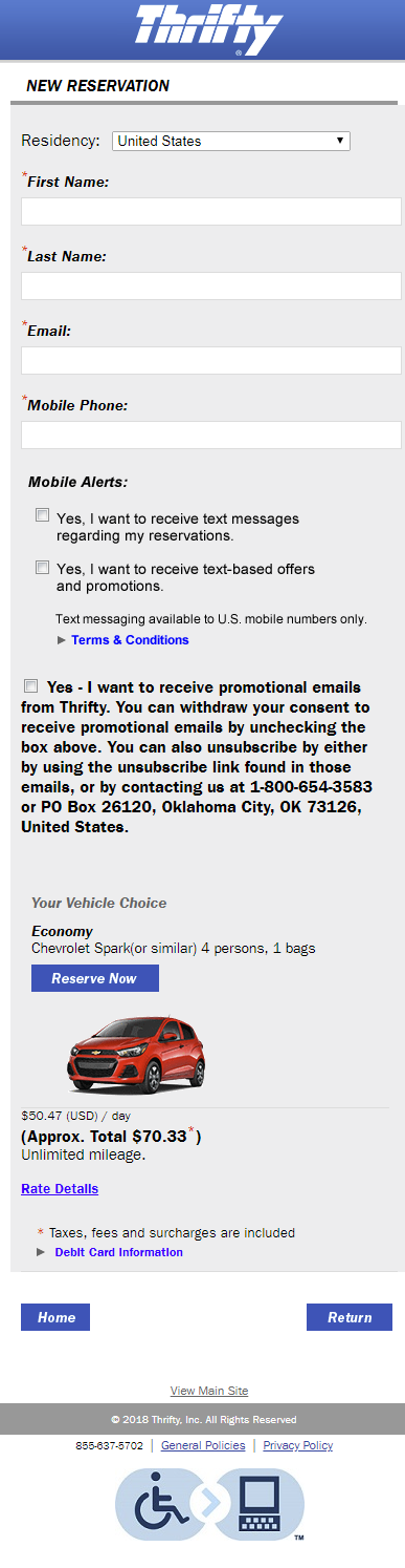
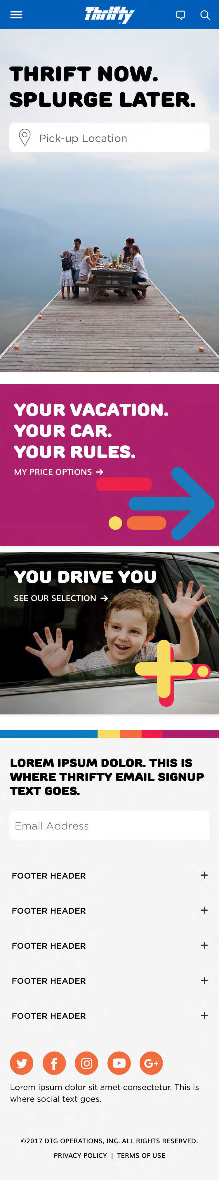
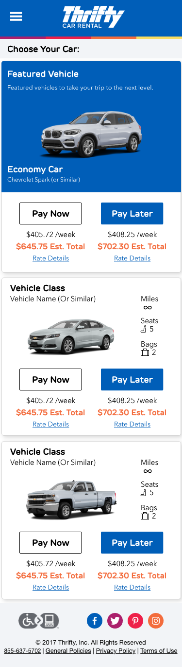
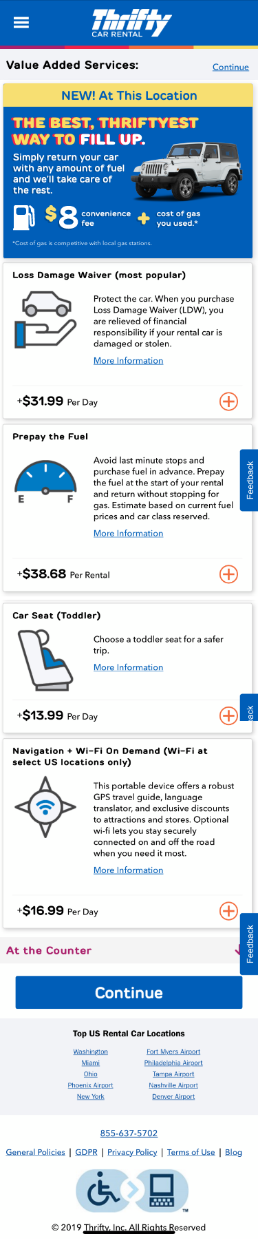
Thrifty Redesign
The Thrifty rebrand was significantly more straightforward with the form factor taking from the Hertz brand with differences for color and slight modification to the promo card options. The primary goal here was to update the severely out of date site, especially the promotional area which customers had begin to think were spam advertisements instead of legitimate promotions. The end result unified the visual language for the app and site adding credibility to the budget brand.
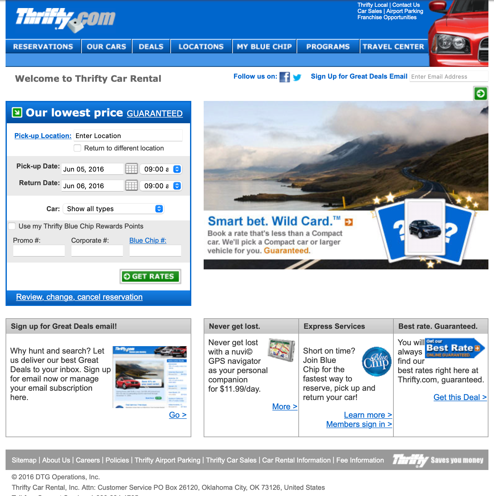
Before 2016
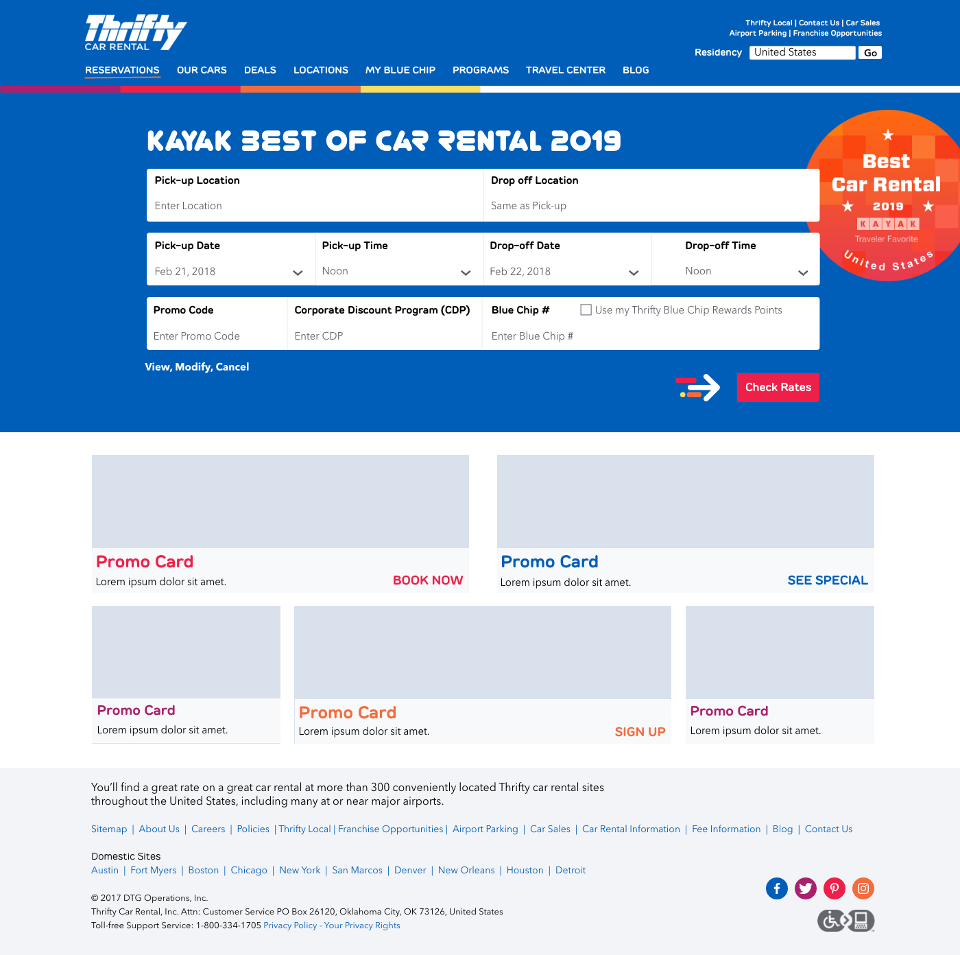
After 2019
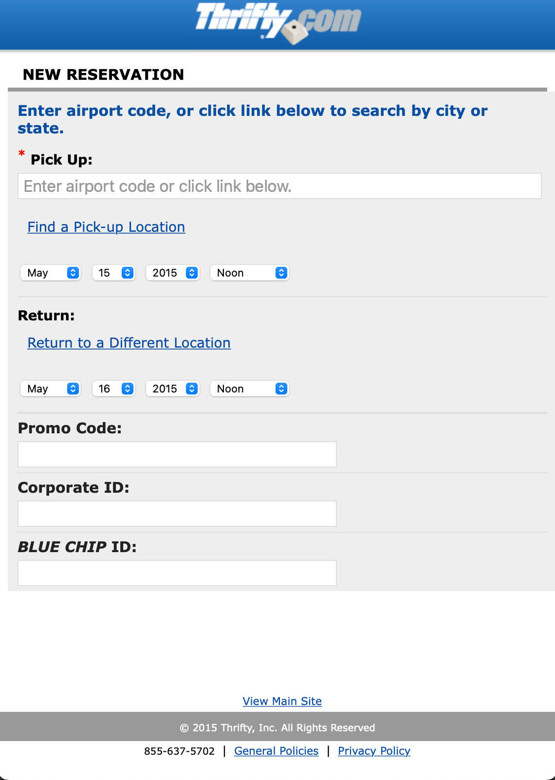
Before 2017
Before 2017
After 2019
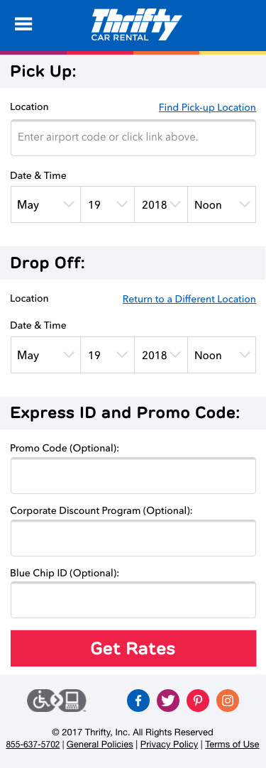
After 2019
After 2019
After 2019
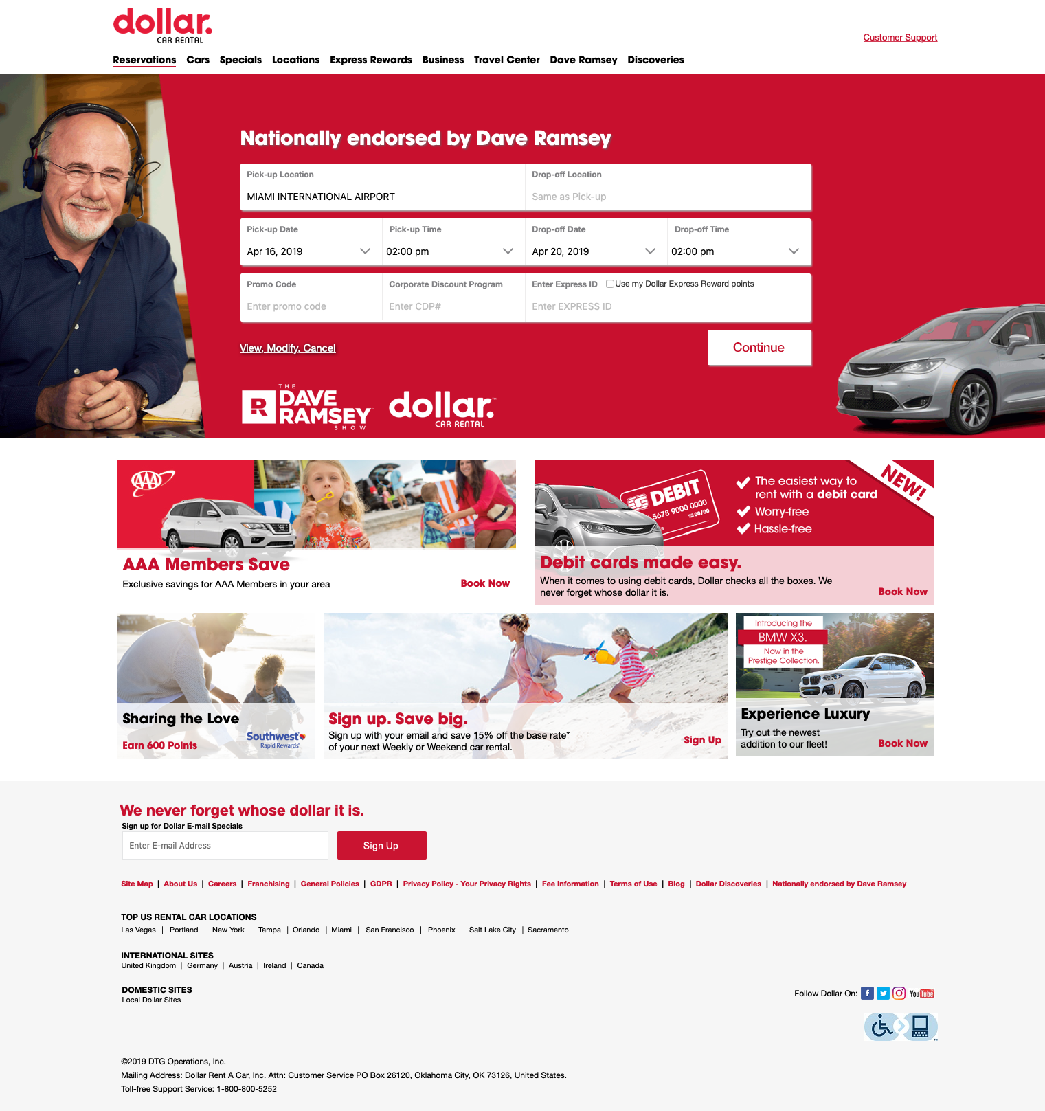
Dollar Redesign
The Dollar rebrand was significant, causing a two stage redesign, first to align the existing site to the new brand before redoing the sit to match the new visual language of the other Hertz brands, giving it a cleaner brighter look aimed to attract money conscious family travelers.
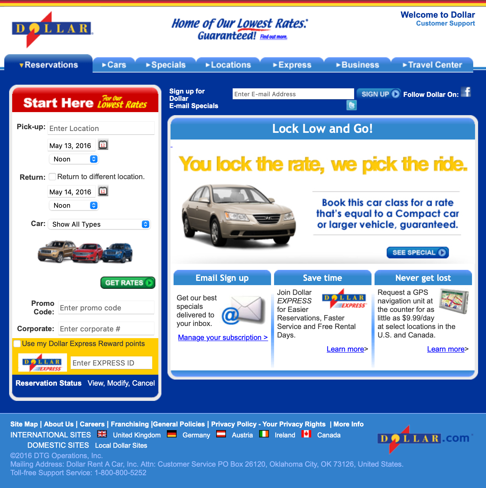
Before 2016
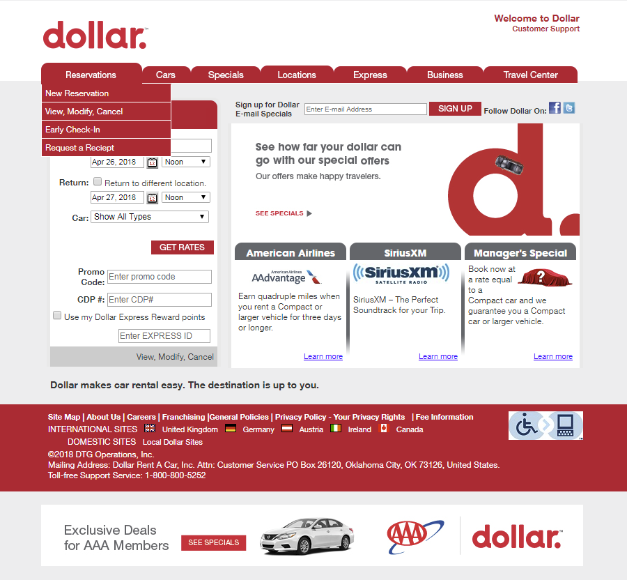
Phase 1 After 2017
After 2018